④ Results tab
After a successful run, the Results tab unlocks three sub-tabs:
| Sub-tab | What it shows |
|---|---|
| Response Curves | How each variable shapes predicted suitability across its data range |
| Jackknife Importance | Which variables matter most, with ROC plotted alongside |
| Spatial Projection | Write the prediction to a GeoTIFF and load it as a styled QGIS layer |
Response Curves
Pick a variable from the drop-down at the top. QMaxent draws the predicted cloglog suitability across the variable's actual training range (shaded band) with the mean as a vertical reference line:
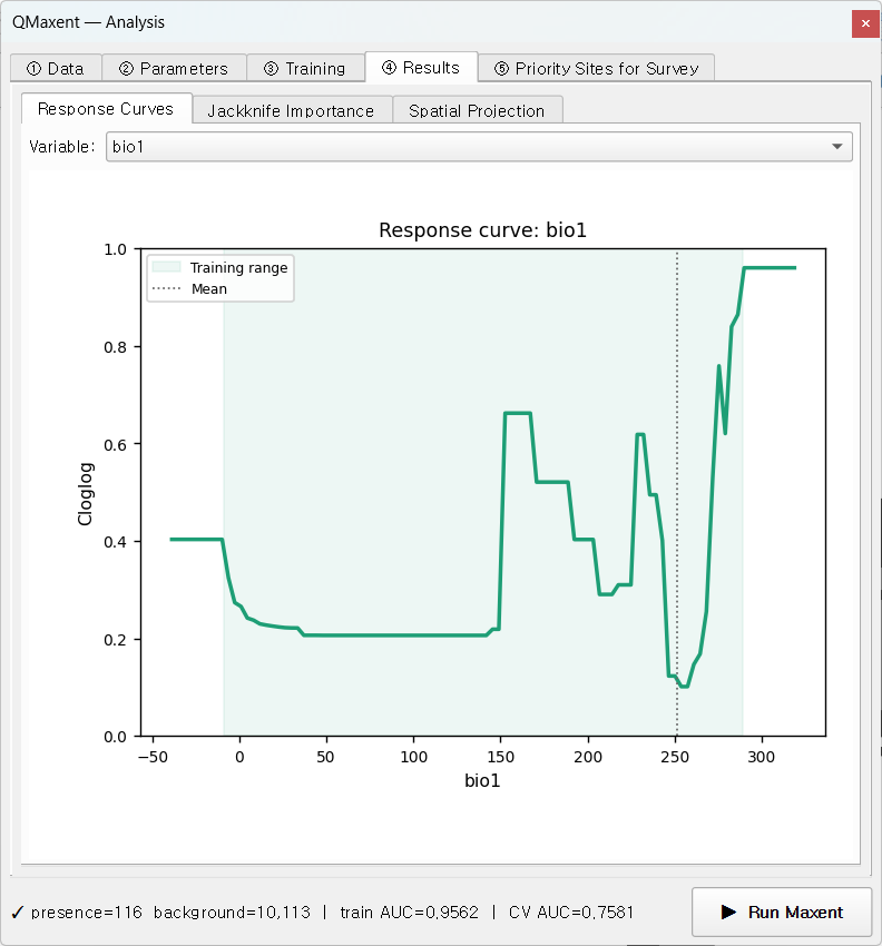
For continuous variables the curve is a marginal-effect plot in the sense of Elith et al. 2011: suitability is computed at the sweep of values for the focal variable while every other variable is held at its mean (or, for categoricals, its modal level).
For categorical variables, QMaxent renders a bar chart with one bar per class, ordered by predicted suitability — visually clearer than the ramped curve a Java-MaxEnt run would produce.
The shaded Training range band is important: predictions outside this band are pure extrapolation. Whenever your eventual spatial projection reaches values outside the band, QMaxent shows a one-off Multivariate Environmental Similarity Surface-style warning (see Elith, Kearney & Phillips 2010) before writing the output GeoTIFF.
The grid view across all variables is the standard
Phillips et al. 2006 summary plot used in publications.
QMaxent saves it as prediction_response_curves.png (300 dpi) when the
Save analysis charts as PNG checkbox is on at projection time — see
Exporting results.
Jackknife Importance
This sub-tab combines the ROC curve and per-variable Jackknife bars in a single panel — the canonical Maxent figure since Phillips, Anderson & Schapire 2006:
Reading the ROC panel:
- Training ROC (solid) — in-sample fit
- Mean CV ROC (dashed) — across-fold mean of held-out folds
- Per-fold ROC (faint) — variance across folds is the model's spatial sub-sample stability
Reading the Jackknife bars:
- With-only (dark) — AUC of a model fit on this variable alone
- Without (light) — AUC of the full model with this variable removed
- A variable with a high with-only and a high without drop carries a unique signal not redundant with the others (the most informative kind).
The bars are sorted by Test AUC drop by default. The same numbers are exported into Table 4 of the XLSX — see Exporting results for the sheet layout.
Spatial Projection
The third sub-tab projects the trained model across all the input rasters, producing a habitat-suitability GeoTIFF.
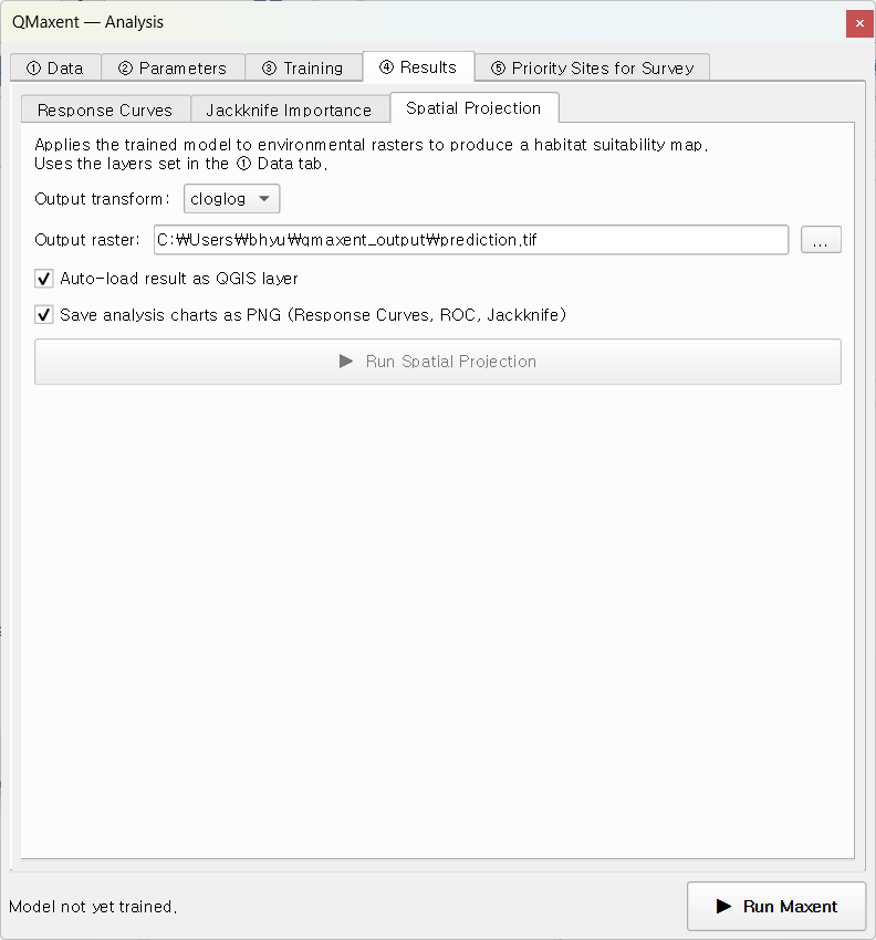
Controls:
- Output transform:
cloglog(default) — interpretable as probability of presence given a typical sample of the species, the form Phillips et al. 2017 recommend as the new default.logistic— the older (Phillips & Dudík 2008) parameterisation; still used in some published baselines.raw— the unnormalised exponential output, mostly useful for advanced post-processing.- Auto-load result as QGIS layer (default on) — the GeoTIFF appears on the canvas with a default white-to-green ramp.
- Save analysis charts as PNG — when on, three additional 300-dpi PNGs (ROC, Jackknife, response-curve grid) are written next to the GeoTIFF. Sized for direct paste into a single-column manuscript figure.
The unified preflight dialog
Before writing the projection, QMaxent runs two safety checks in a single combined dialog:
- Categorical-code coverage — any class code present in the projection rasters but unseen during training is auto-masked to NoData (rather than silently extrapolated to a random class probability).
- Continuous-variable extrapolation — if any continuous variable's projection range exceeds its training range (Elith, Kearney & Phillips 2010), the dialog reports the affected variables and the magnitude of the excursion.
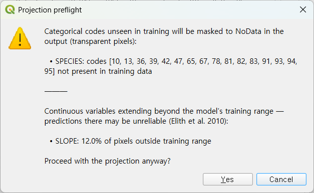
Click Yes to proceed; No aborts the projection so you can revise the input rasters.
After the projection
A success message appears in the panel:
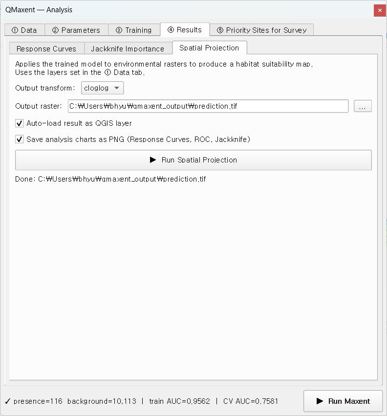
The GeoTIFF is loaded into QGIS with a default white-to-green ramp keyed to the cloglog 0–1 range, ready to compose into a publication map.
Next
Move to the ⑤ Priority Sites for Survey tab to turn the suitability raster into a field-ready candidate point layer, or skip ahead to Exporting results to learn what is in the output workbook.