Bradypus variegatus¶
The brown-throated three-toed sloth — Bradypus variegatus — is the canonical Maxent test dataset, originally published with Phillips, Anderson & Schapire 2006 and reused in virtually every subsequent Maxent paper. We use it here as a guided tour of every QMaxent feature: dependency setup, data loading, parameter selection, spatial cross-validation, jackknife and permutation importance, projection, and survey planning. By the end of this chapter you will have produced — and be able to defend academically — a complete Bradypus habitat-suitability model.
0. Before you start: dependencies¶
QMaxent installs its third-party Python libraries (elapid, rasterio, geopandas, scikit-learn, scipy, numpy, matplotlib) into an isolated virtual environment so they cannot conflict with QGIS's own Python. The first time you open the plugin, you are invited to perform a one-time install:
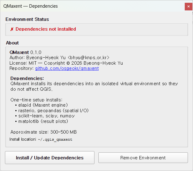
Click Install / Update Dependencies. The progress bar walks through the four pip phases (collecting, downloading, building, installing) and finishes with the green badge below — at that point every QMaxent feature is ready to run.
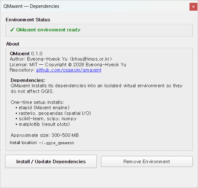
If you ever need to recreate the venv (e.g. after a major QGIS upgrade), the Remove Environment button on the same dialog is the clean way to start over.
1. Dataset¶
The Phillips et al. (2006) dataset contains:
| Layer | Type | Description |
|---|---|---|
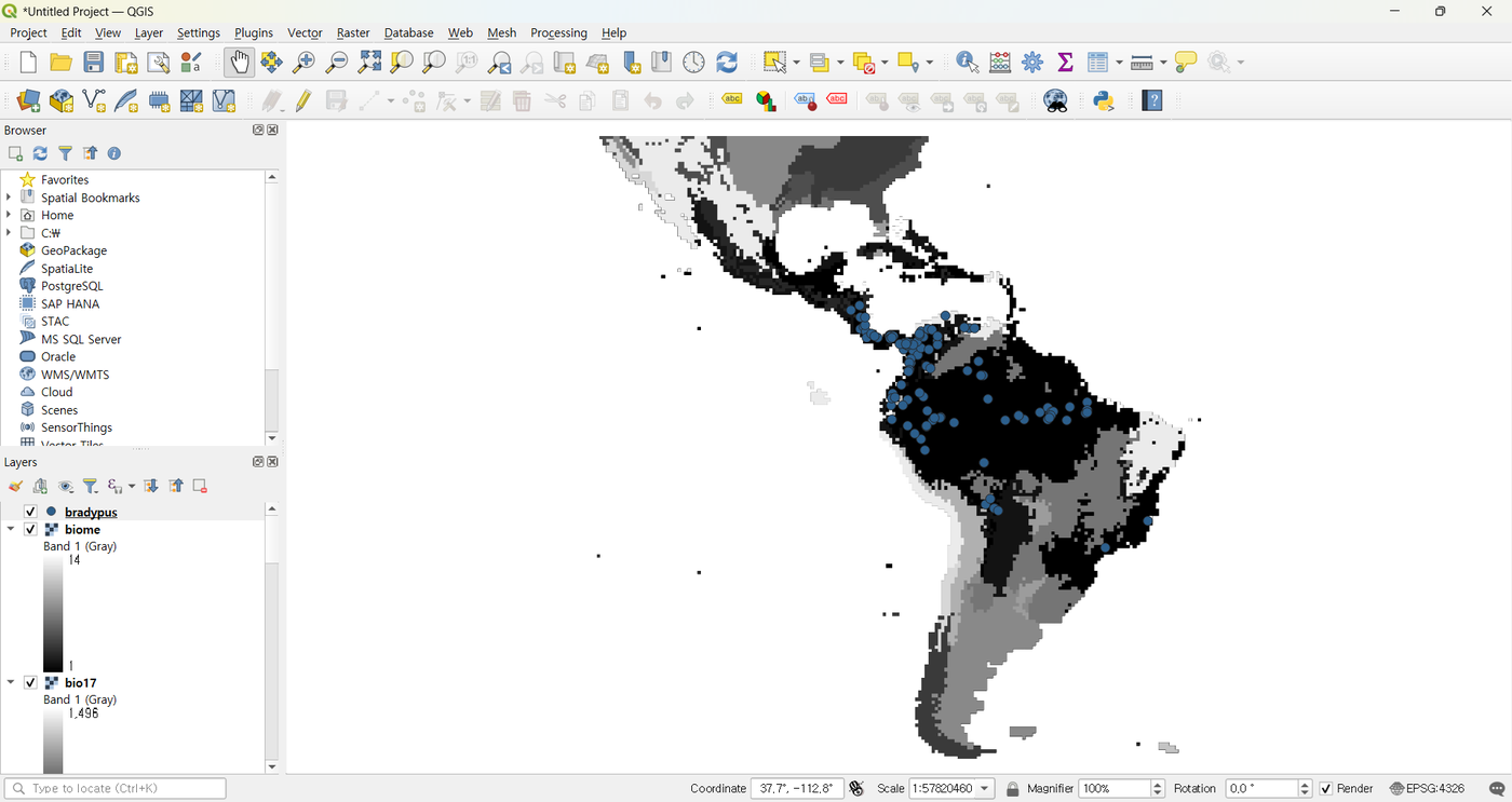
bradypus |
Vector point | 116 occurrence records across South and Central America |
bio1, bio5, bio6, bio7, bio8 |
Continuous raster | Temperature variables (WorldClim) |
bio12, bio16, bio17 |
Continuous raster | Precipitation variables (WorldClim) |
biome |
Categorical raster | Biome type (Olson et al. 2001) |
All rasters share the same grid: EPSG:4326, 0.5° × 0.5° cells, full Americas coverage. Total dataset size < 100 MB.
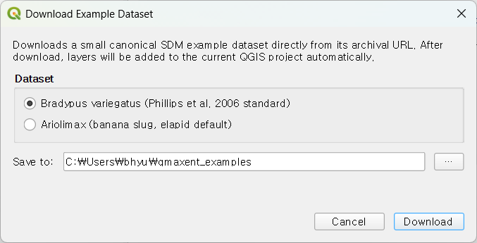
Download via Plugins → QMaxent → Download Example Dataset, pick Bradypus variegatus (Phillips et al, 2006 standard), choose a destination folder, and click Download:
Layers are added to the QGIS project automatically:
2. Loading data into the Analysis dock¶
Open Plugins → QMaxent → QMaxent Analysis. On ① Data, pick
bradypus from the Presence Points Layer drop-down — QMaxent
immediately reports 116 presence points loaded.
Click Add from project to register every loaded raster at once. The
biome row gets a [categorical] tag (its sidecar metadata says so).
Click Check Raster Consistency to verify the grid; the status line
should read
✓ All 9 rasters share grid (CRS: EPSG:4326, resolution: 0.5 × 0.5),
exactly what you expect from the bundled dataset:
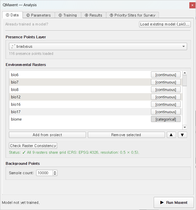
Background Points is left at its default of 10,000, the value Phillips & Dudík 2008 recommend for continental extents. The Export for external Maxent panel at the bottom is optional — leave it alone for this tutorial; see Exporting results for when it matters.
3. Model setup¶
Switch to ② Parameters. For this tour we accept every default — each default is the literature-recommended value, and accepting them lets us inspect what those choices produce:
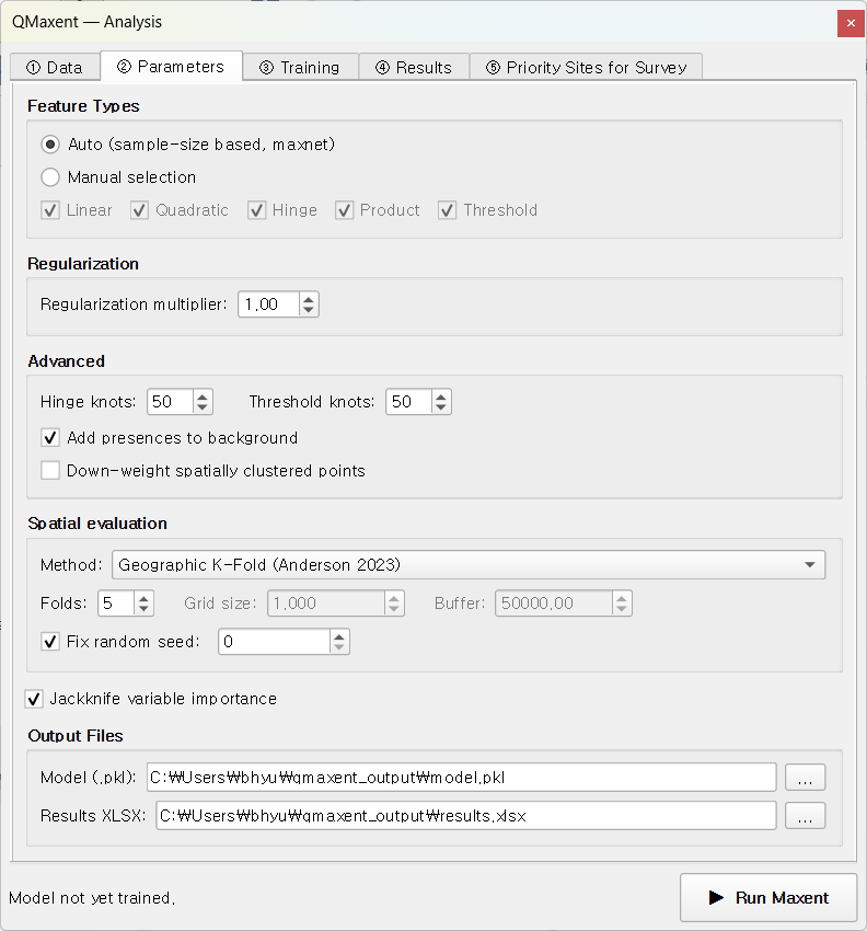
- Feature Types: Auto (the maxnet rule of Phillips & Dudík 2008 selects all of LQPHT for 116 presences).
- Regularization multiplier: 1.0 (Phillips & Dudík 2008 recommendation).
- Spatial evaluation: Geographic K-Fold (Anderson 2023), 5 folds, grid 50,000 m, buffer 50,000 m, fixed random seed = 42 (Roberts et al. 2017 default).
- Jackknife variable importance: enabled.
- Permutation importance: enabled, 10 repeats.
- Output files:
qmaxent_output/model.pklandqmaxent_output/results.xlsx.
The fixed random seed means anyone re-running this tutorial gets bit-identical results — central to computational reproducibility (Araújo et al. 2019).
4. Running training and cross-validation¶
Click ▶ Run Maxent. The ③ Training tab takes over and finishes in about 30 seconds:
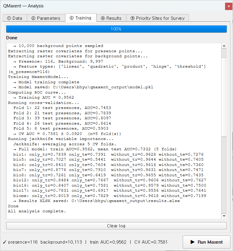
The status bar at the bottom summarises the run:
presence=116 background=10,104 | train AUC=0.9569 | CV AUC=0.7436.
Reading the log section by section:
- Full-data model —
Training AUC = 0.9569, saved toqmaxent_output/model.pkl. - Cross-validation — Geographic K-Fold n=5, seed=42:
| Fold | Test presences | AUC |
|---|---|---|
| 1 | 58 | 0.7779 |
| 2 | 20 | 0.7711 |
| 3 | 22 | 0.7531 |
| 4 | 8 | 0.5994 |
| 5 | 8 | 0.8165 |
Pooled mean ± std = 0.7436 ± 0.0750.
- Jackknife variable importance — per-variable AUC across the same 5 folds in three modes (full-model reference, only this variable, and without this variable). The numbers feed the Jackknife plot below.
- Permutation importance — sklearn
permutation_importancewithn_repeats=10, evaluated on the held-out test set. Results feed the Permutation Importance sub-tab. - Save results —
results.xlsxandtraining_log.txtare persisted next to the.pkl.
Train AUC = 0.957 while CV AUC = 0.744 ± 0.075. That gap is the cost of holding out spatially-distinct validation sets — and a far more honest measure of real-world predictive performance than the inflated training AUC alone, exactly the point Roberts et al. 2017 make.
Folds 4 and 5 have the smallest validation set (8 presences each) and the largest spread in AUC. In spatial CV, folds are intentionally uneven in area, and one fold can land on a small, atypical region. The pooled CV AUC averages over this variance — the ± 0.075 standard deviation is precisely the quantity you would cite alongside the mean in a publication.
The full log is exportable via Save log as… at the bottom of the tab; Copy log drops it into the clipboard, handy for pasting into an issue report.
5. Inspecting variable behaviour¶
Response curves¶
On ④ Results → Response Curves, pick bio12 (annual
precipitation):
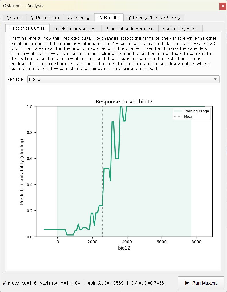
The model assigns highest suitability to the 1,500–3,500 mm/year band — the climatology of South American rainforest — with a sharp drop-off below ~800 mm. The shape combines hinge and quadratic features. Try other variables in the drop-down: smooth U- or peak-shaped curves indicate quadratic terms; sharp angular discontinuities come from hinge or threshold features.
Jackknife importance¶
The Jackknife Importance sub-tab compares each variable's stand- alone signal against its incremental contribution. Dark bars (Only this variable) and light bars (Without this variable) tell you each variable's unique value:
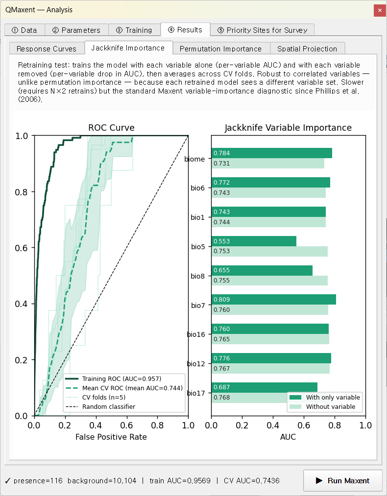
For Bradypus:
bio7(annual temperature range) andbio12(annual precipitation) have the strongest stand-alone signals.biomeandbio6(min temp of coldest month) come next.- The "without" bars are tightly bunched in the high-0.9s — Maxent recovers from removing any single variable because the climate variables are correlated. This is the textbook Phillips, Anderson & Schapire 2006 pattern.
Permutation importance¶
The Permutation Importance sub-tab reports the same idea from a
different lens: scikit-learn's permutation_importance shuffles each
variable's values on the held-out test set, measures the AUC drop,
repeats 10 times, and normalises to 100% of the total:
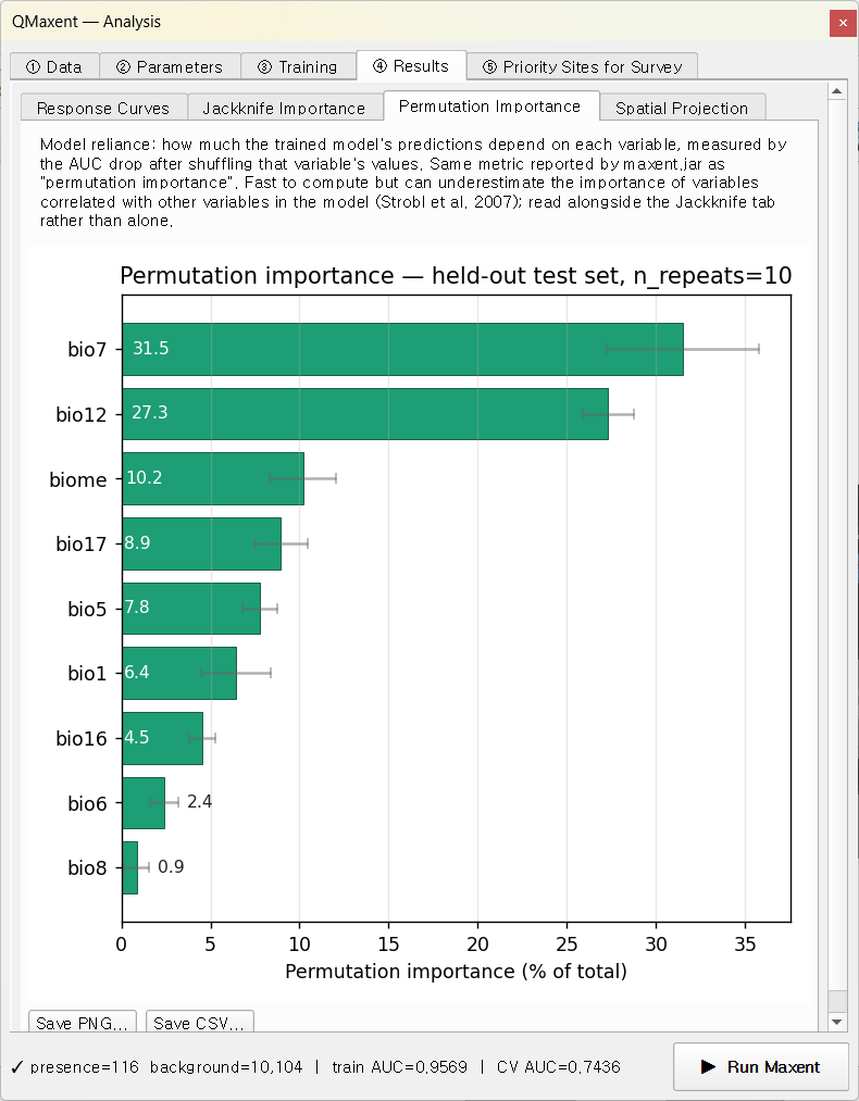
bio7 and bio12 again dominate; the permutation view distributes
the total importance across all variables and is therefore directly
comparable to maxent.jar's per-variable percentage table.
6. Spatial projection¶
Switch to Spatial Projection in the same Results tab. Leave cloglog as the output transform (the Phillips et al. 2017 recommended default) and Auto-load result as QGIS layer ticked, then click ▶ Run Spatial Projection:
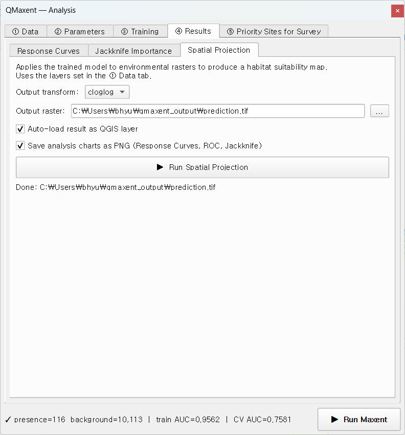
The map appears in QGIS with auto-styled white-to-green ramping:
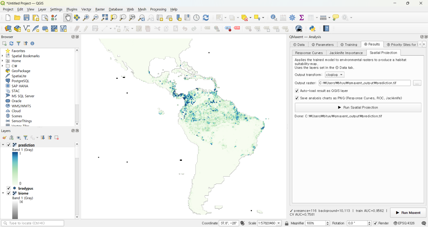
The high-suitability core covers Brazil's southeastern Atlantic Forest and the Amazon basin — both well-known sloth strongholds — plus secondary patches across Central America. The model correctly identifies the unsuitability of the Andes (cold, high altitude) and the very dry Brazilian Northeast (Caatinga).
7. Saving outputs¶
Two files are written automatically:
qmaxent_output/model.pkl— the serialised trained model. Reload it later from the Data tab's Load existing model (.pkl)… button or share it with collaborators. Security note in Saving and reusing models.qmaxent_output/results.xlsx— the multi-sheet supplementary table containing experimental setup, variable list, CV results, jackknife, permutation, response-curve breakpoints, and threshold tables. See Exporting results for the sheet-by-sheet layout.
If you ticked Save analysis charts as PNG before projection, four additional 300-dpi PNGs of the response curves, ROC, jackknife, and permutation panels are written next to the GeoTIFF — sized for direct paste into a single-column manuscript figure.
8. Priority sites for survey¶
A natural next step is to use the trained model to plan follow-up surveys. ⑤ Priority Sites for Survey offers two distinct modes — Discovery (looking for new populations) and Validation (stratified field-checks across the suitability gradient).
8.1 Discovery mode¶
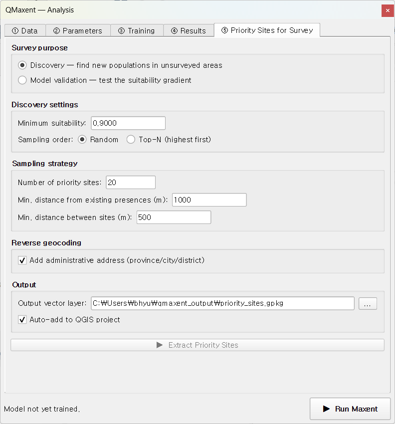
Discovery picks candidates from a high-suitability band. Open the
tab, keep Discovery as the mode, leave the auto-set minimum
suitability of ~0.81, set n_sites = 20, leave the 1 km / 500 m
spacing defaults, and click ▶ Extract Priority Sites:
20 candidate locations (red dots) appear on the suitability map, with their attribute table populated by Nominatim reverse geocoding:
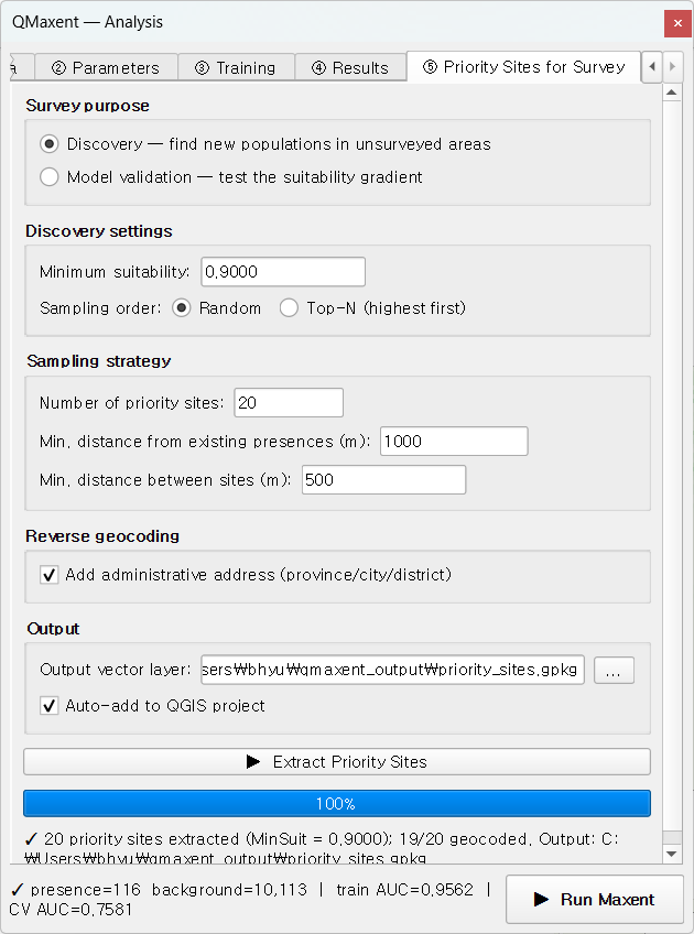
Each candidate is at least 1 km from any known occurrence and at least 500 m from any other candidate, so a single field trip can plausibly cover several at once. Discovery is the right mode when the question is "where could the species be that we have not yet looked?" — the Rhoden et al. 2017 "Maxent-directed surveys" paradigm.
8.2 Validation mode¶
Switching the Survey purpose to Validation draws a different kind of sample: candidates are stratified into four quartiles of suitability (above a configurable threshold), so a field trip can test the model's calibration across the full predicted gradient rather than only its high-suitability core:
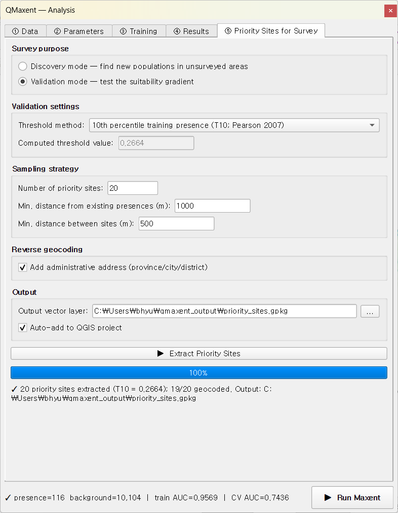
The resulting sites span low- through high-suitability cells in roughly equal numbers, each tagged with its quartile in the attribute table:
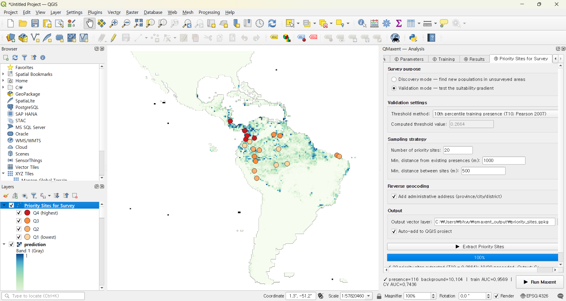
Validation is the right mode for model verification rather than discovery — it is the field-side complement of the cross-validation AUC we computed in § 4.
Next steps¶
- The same workflow with messy rasters: Ariolimax example starts from rasters that do not share a CRS or resolution — exercising the Check + Harmonize tools.
- Compare your workflow to a published study: Pitta nympha example reproduces a published Java MaxEnt analysis in QMaxent and discusses where the two pipelines agree and differ.
- Deeper theory: Methodological background explains why each default we accepted in this tour is the right choice.